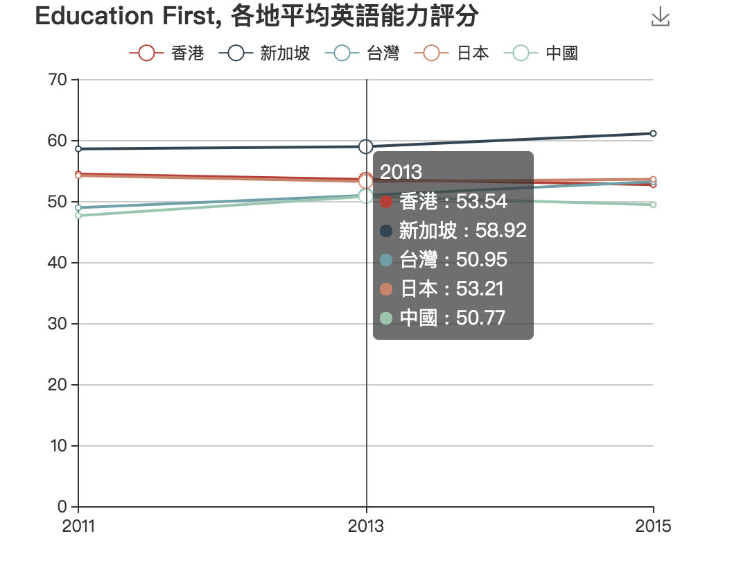
Here is the original data visualisation photo:

Introductioin of this graph:
This graph was taken from the pervious students' work in Data Viualisation 2017, which was made to show that Hong Kong's English education level has fallen in recent years. The whole graph is responsive. As you click different districts, the line that presented corresponding places will shown in the graph.
However, since the start point of this graph is 0, the line above may overlap on one another.
Also, the color of Hong Kong's line need to be standout which can contribute to the comparison between it and other districts.
The suggested changing:
First, make the start point of this garph is't 0, and I made it to 45. In this way, the
Then, I will highlight the Hong Kong line to red.